Final post for Potato Pirates!

Gif Main menu Potato Pirates
Main menu without the buttons. The animation is just to show you guys that the clouds will move . This blog page can only upload things in potato quality so that’s why it is in potato quality. 


This week has been exhausting. Let me first apologize for the terrible grammar and spelling you’re about to endure. My trusty spellchecker, my girlfriend Victoria will not be able to proof read what I write this week so now you have to endure the train wreck that is my written English.

As I’m writing this it’s less then 20 hours before the final version of the Potato Pirates game is to be submitted. The work creating it has been exhausting and… So. Much. Fun! I’ve been animating like crazy, bossing around and crying blood at times, but it’s finally completed (well, close to being completed)!

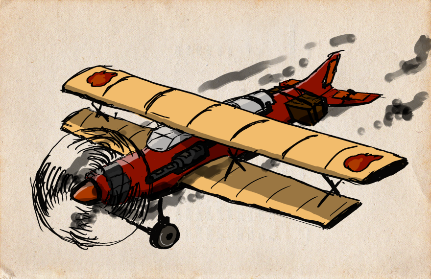
This week I’ve been animating a potato drop menu (won’t go into that but it took me quite some time) and creating a new main menu. I’m not going to write about the drop menu, I’m just going to show it of, since it’s so cute. LoL.

rlSj5y
Skriv en bildtext

What I am going to write about is the main menu scene I’ve made. It has taken me 20 hours to make and some stiff shoulders, but I’m quite happy with the result.

Our last main menu art was a couple of mountains. Clouds  were moving slowly from left to right. I was given the task to create a new such scene, but more detailed. The environment we have in the game is a landscape with mostly free nature, lots of grass, woods and mountains. So I made a main menu with lots of grass, woods and mountains…

First I was going to create the scene to look like it’s night time, but decided against it. In the game it makes sense since we use lights to show were enemies and points of interests are. In the main menu how ever I felt that a day scene would better show the quite features in the picture. A main menu scene in darkness felt so.. dark

I made the scene in two layers, one is the foreground and includes the two closest mountains and the field between them. The second layers include the mountains you see in the background and the field in front of them. By putting clouds between the layers, it will look like they are moving in the distance. The other clouds I made I put in front of it all, and they are moving across the picture slowly. In the gif I posted you can see how that clouds move, however it moves straight and very smooth in the game, not like it does in the gif (didn’t really have time, I’m sorry!).

I’ve used colors to help simulate perspective in the picture, and things get brighter the further away they are since the air between the eye and the object can bee seen!

Thanks for reading folks!Main menu high ress

Blogpost Four!


Another week of animation! Since last week I have had so much fun with the new death animation for the player plane. This week I got to do the death animation for the blimp, or the “Led Zeppelin” as it’s called. Erik Levin in our group made the Led Zeppelin’s moving animation and art in the game. It was up to me to make his nice blimp blow up. Fine by me mohahahaha.

zeppelin sprite sheet.png

Erik’s blimp, now this is gonna be fun to blow up!


So how does a blimp explode? It doesn’t crash like a plane does, the only blimp crash I know of is the Hindenburg and I wanted to avoid  connection to that as much as possible. Our game has a comic tone to it anyway which would not go well with the Hindenburg reference. Instead, I chose to have a more comedic crash than a realistic one. Also, this blimp is not filled with anything flammable…


So how does a blimp crash comically? I decided to think of the blimp not as a blimp but more like a giant balloon. So what happens to a balloon if it would be pierced by a small potato (we shoot potatoes in the game)? My first thought was to make it fly away and deflate, like a balloon you let go of after you inflate it. However, such an animation would take me quite a long time and time is kind of scarce so I chose the other posibility. The balloon would just pop with a bang! The blimp also has a cabin on it’s belly so I decided to simply let that cabin drop straight downwards. Since the blimp moves so slowly, it would make little sense if the cabin would fly off in any other direction. Besides, it looks even more comical when it drops like a stone.


ESgD0d.gif


Since time was not on my side doing this and it’s the third animation I’ve done this week, I decided to play with photoshop and avoid as much new art as possible. I took the old sprite (image) and simply cut it up in a lot of, what is called in photoshop, layers. Once I had all those in layers I could simply move them a little away from the explosion and make them more transparant the further along the animation goes. I also added the little explosion which is made with two circles. First frame, the two circles are fairly small with a touch of motion blur to them. Second frame, I’ve enlarged the circles and added even more motionblur. The cabin was simple, I just made it smaller in every frame while at the same time making sure it’s positioned at the same exact spot.
Thats all for this week folks!

Third blogpost, DEATH!

Time for the third blogpost! Last week, I described how I had been redoing our animation. We started with a playersprite (sprite means picture, a single frame of an animation) that turned out to be the wrong size. We liked it and I did alot of animation with this sprite as the original. During our first playtest, however, we discovered that the sprite was too small and we tried to enlarge it but it looked out of focus. It looked terrible.


Thus I’ve spent well over thirty hours in total redoing all the different player animations and during this week I’ve mainly been redoing the death animation. My original death animation was the first animation I had ever done and it took me quite some time to do. It made me very proud, so it was soulcrushing to have to redo it. At the same time, I was glad to be able to remake it and put even more of my own touch into it andthis time it will be made from my own original sprite.

Below you have the two death animations, the left one is the new one and the right one is the old one.

dLVHoXiGac8k

At  first, I was tempted to simply duplicate the death animation exactly only using the larger image I had created. I kind of liked the little chip of the wing that breaks off and explodes separate from the rest of the plane. On closer examination ingame, I noticed that the player could be hit at any part of the plane when in a fight. Thus, it will look odd if it always loses it’s left wing. The forced remake of the animation gave me a golden opportunity to change this and I did. Now the plane starts burning from the mainbody, the part that will probably always be hit anyway. It can also be interpreted that the engine is catching fire. Both reasons seem more realistic than the player’s wing always getting shot off.  I also gave the plane more shading the further away it gets from the camera, since it is also getting further away from the lightsource. However, I did not change how the highlights and shadows move on each sprite as the plane turns even though they would, in reality. It would simply be too much work for something that happens almost too fast to actually see.

Perspective oh my gosh!

I also decided to create a new sprite of the plane where it is tilted slightly downwards. To do that, I once again had to wrestle with perspective drawing. I decided that it was a good excercise but sixteen hours of animating later, I almost changed my mind. Below, is one of the sprites of the plane going down but without the smoke. To the right of that you have the original plane sprite.

Player plane v2 colorDeath animation 2, 1 smokeless

To do this I actually made a little model plane to look at as a demonstration of how perspective changes.. I put a ruler through an empty toilet paper roll and I tilted it foward and copied it. I added shadows to it to really tell the eye that the plane has changed perspective. I also added alot of details you would’nt be able to  see when the plane is strictly topdown. You can now see the round shape of the potato canon on the left wing, the shape of the boxes and the propeller spinning. The propeller is going to be changed in the final version of the game on each plane animation. We are going to put a “moving propeller animation” on top of the different player sprites because it would simply be too much work changing every sprite (including the enemy planes) on every single animation.

Second Post: Whoops


vKTf5x
New turning animation
HnaI7T
Old turning animation, whoops

This week began with a big whoops. On Monday, we all had our prealphas each different  group presented what they had so far and let classmates try their game. This was important for us in order to get feedback about what people thought of our games; everything from design choices to whether the player felt he/she had good control of the plane avatar.

An overwhelming amount of people told us that the avatar (the plane) was too small. We listened and tried to enlarge the plane but noticed instantly that the avatar did not look good. The lines looked unclear and pixely, the colors were patchy and in some places you could still see white spots where the plane had no colors. Whoops.

This was, of course, problematic since all the player avatar animations I’ve created so far are made from one sprite. We had the choice to either keep the plane the same size or make a new avatar sprite that looked better when zoomed in on and more cartoonish to go along with the rest of the games aesthetics. We chose the latter.

Fix the whoops!

This week has been all animating for me, once again, but this time I tried to take what I learned from the animations I created last week. The old plane looked a bit flat, which is always a problem when creating a game with a topdown perspective, like the one we’re making. So I asked myself, how can I make the seconnd plane look like it has shape? I want a round plane with mass, not a flat paper plane.

The decided that the best answer lies in what my first plane lacked, shadows. By using shadows I can show what is closer to me and what is further away and give the plane the much needed illusion of mass.

It might also be hard to see but I added a better perspective on the wings. In the old animation, the wings where the same width whether it was turning or not. This time, I made the wing closest to the camera bigger and wider while the one further away, smaller and thinner. I even added a highlight on the wing closest to the camera, created by the pretend moon that can’t actually be seen in the game. We have colored everything in ourgame as if it waslit by the moonlight.

Player plane v2 right turn 2
Shadows and highlights create illusion of mass, wohooo


So how did I do this? Photoshop. Last week, I used the regular sprite (the one with the plane simply flying forward) and  moved the plane in photoshop to make it look like it was turning. I then resized the wings to make the further one shorter towards the direction it was turning. I then painted it, copied it and mirrored it. After that, I had an easy time of moving the cannon (the only thing that can’t be  mirrored since it’s not identical on both sides).

When making the new version of that same animation I simply added more shadows and clearer lines. I say simply but it took a lot of time for me since I’m very new at this.

For the alpha, this will be enough but I plan to make another frame/sprite in each direction the player turns to make the animation ”smoother”.

First Post!

iGac8k

Gustav here, with my first post about the Potato Pirates project!

I’m part of team 7 and we’re studying game design, first year, on Gotland. We are currently doing a game called Potato Pirates, a topdown spaceshooter about smuggling potatoes!

Early in the making of our game, we felt like we needed a clear visual representation of when you lose or “game over”, if you will. The alpha needs only the bare essential visuals and we felt that the death animation of the player was such a feature. Mind you, this death animation may not be the final version and will be improved upon if I have time later; however, in the alpha, it will suffice as a signal to the player.

Last week, I was in charge of making a death animation for our avatar.  I wanted the plane to not just explode but also lose altitude and then crash. I did that by copying the plane a few times and making it smaller each time. I also added the extra feature of the broken of wing because I felt like that signals ”oh no” on a plane better than most other things plane-related. The only problem I had with this was, where does the wing go? I can’t let it be on seperate images because that would be too much of a headache for the programmers. So, I simply let the broken wing fly along with the rest of the plane and crash. This may not agree with physics but we’ll see if I change it later on.

When the animation is actually excecuted in the game, the player will not be just dropping straight down like the little video you see here. Instead, the player will be moving in the direction it’s heading for the duration of the animation and then stop when the explosion happens.

This was before we had any lessons on the subject and I simply made a lot of pictures that kind of looked like they went together and said to the programmers ”here you go!” They went mad and said something about a spritesheet so Sakarias, the colormanager on our team, went and made that for me, truly a gentleman!


Player Plane Sprite Sheet 2.png
Spritesheet made by Sakarias, the gentleman!


Since it’s very hard for the programmers to put the individual pictures (sprites) into the actual game. Coding it gets significantly easier if you put those sprites into a spritesheet, like the one above. The spritesheet contains all the frames of the animation in the correct order and size in one single document.

Just for fun, here you have the concept art I made of the plane in question!

Player plane.png