
This week began with a big whoops. On Monday, we all had our prealphas each different group presented what they had so far and let classmates try their game. This was important for us in order to get feedback about what people thought of our games; everything from design choices to whether the player felt he/she had good control of the plane avatar.
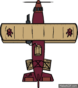
An overwhelming amount of people told us that the avatar (the plane) was too small. We listened and tried to enlarge the plane but noticed instantly that the avatar did not look good. The lines looked unclear and pixely, the colors were patchy and in some places you could still see white spots where the plane had no colors. Whoops.
This was, of course, problematic since all the player avatar animations I’ve created so far are made from one sprite. We had the choice to either keep the plane the same size or make a new avatar sprite that looked better when zoomed in on and more cartoonish to go along with the rest of the games aesthetics. We chose the latter.
Fix the whoops!
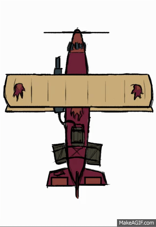
This week has been all animating for me, once again, but this time I tried to take what I learned from the animations I created last week. The old plane looked a bit flat, which is always a problem when creating a game with a topdown perspective, like the one we’re making. So I asked myself, how can I make the seconnd plane look like it has shape? I want a round plane with mass, not a flat paper plane.
The decided that the best answer lies in what my first plane lacked, shadows. By using shadows I can show what is closer to me and what is further away and give the plane the much needed illusion of mass.
It might also be hard to see but I added a better perspective on the wings. In the old animation, the wings where the same width whether it was turning or not. This time, I made the wing closest to the camera bigger and wider while the one further away, smaller and thinner. I even added a highlight on the wing closest to the camera, created by the pretend moon that can’t actually be seen in the game. We have colored everything in ourgame as if it waslit by the moonlight.

So how did I do this? Photoshop. Last week, I used the regular sprite (the one with the plane simply flying forward) and moved the plane in photoshop to make it look like it was turning. I then resized the wings to make the further one shorter towards the direction it was turning. I then painted it, copied it and mirrored it. After that, I had an easy time of moving the cannon (the only thing that can’t be mirrored since it’s not identical on both sides).
When making the new version of that same animation I simply added more shadows and clearer lines. I say simply but it took a lot of time for me since I’m very new at this.
For the alpha, this will be enough but I plan to make another frame/sprite in each direction the player turns to make the animation ”smoother”.

Hello Gustav!
First of all I want to say only good things about how you have written the text. The text is written in a way that it’s easy for everyone to understand and know the changes you have made to your design! I also want to say that it was good how you made a different paragraph in the end for explaining how you planned to proceed on your task! And also, for everyone to understand why you made the certain changes, it was really good that you put the ”before” and ”after” pictures! With help of those pictures, I could easily compare them and see the big difference!
As for the picture, I have to say that the new version looks so much better! It’s good that you decided to work on the shadowing and lighting part because it really gave the plane more dimension! Also the changes that you made to the wings were really good because in the new picture I could clearly see the perspective in the drawing! So good job!
I don’t really have any ideas to improve anything. Overall, the text and the pictures were superb! 🙂 If I need to point out something, I would remark that the front of the plane is maybe(?) missing a line when it curves to left and right!
-Karo :)))
GillaGillad av 1 person